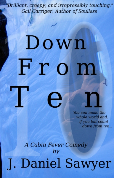
So, I’ve never been quite happy with the cover art for DF10. What I saw in my head never quite came through on the screen, and I wound up with a collection of images that, while possibly intriguing, felt…confusing. It was too dark in the wrong places, you couldn’t tell what the elements were, and all in all it just didn’t quite work.
With the paper version of DF10 coming out late in May, AWP Books decided that it needed to redo the cover art from scratch. Yesterday they sent me the prelims. A few minor tweaks may happen (mostly centered around font choice), but on the whole, I think I like it–so I wanted to share it with all of you:
Feel free to chime in!
jdsawyer
After a childhood in academia, J. Daniel Sawyer declared his independence by dropping out of high school and setting off on a series of adventures in the bowels of the film industry, the venture capital culture of silicon valley, surfing safaris, bohemians, burners, historians, theologians, adventurers, climbers, drug dealers, gangbangers, and inventors before his past finally caught up to him.
Trapped in a world bookended by one wall falling in Berlin and other walls going up around suburbia and along national borders throughout the world, he rediscovered his deep love of history and, with it, and obsession with predicting the future as it grew aggressively out of the past.
To date, this obsession has yielded over thirty books and innumerable short stories, the occasional short film, nearly a dozen podcasts stretching over a decade and a half, and a career creating novels and audiobooks exploring the world through the lens of his own peculiar madness, in the depths of his own private forest in a rural exile, where he uses the quiet to write, walk on the beach, and manage a production company that brings innovative stories to the ears of audiences across the world.
For news and free stories, sign up for his occasional newsletter. Or find his contact info, podcasts, and more on his home page at http://www.jdsawyer.net
*grin* Yeah, that’ll do nicely. 😀 I agree that the fonts need help, but I like the picture, and “A Cabin Fever Comedy” is a delightfully warped way to describe a delightfully warped book. 🙂
{"id":null,"mode":"button","open_style":"in_place","currency_code":"USD","currency_symbol":"$","currency_type":"decimal","blank_flag_url":"https:\/\/jdsawyer.net\/wp-content\/plugins\/tip-jar-wp\/\/assets\/images\/flags\/blank.gif","flag_sprite_url":"https:\/\/jdsawyer.net\/wp-content\/plugins\/tip-jar-wp\/\/assets\/images\/flags\/flags.png","default_amount":500,"top_media_type":"none","featured_image_url":false,"featured_embed":"","header_media":null,"file_download_attachment_data":null,"recurring_options_enabled":true,"recurring_options":{"never":{"selected":true,"after_output":"One time only"},"weekly":{"selected":false,"after_output":"Every week"},"monthly":{"selected":false,"after_output":"Every month"},"yearly":{"selected":false,"after_output":"Every year"}},"strings":{"current_user_email":"","current_user_name":"","link_text":"Leave a tip","complete_payment_button_error_text":"Check info and try again","payment_verb":"Tip","payment_request_label":"","form_has_an_error":"Please check and fix the errors above","general_server_error":"Something isn't working right at the moment. Please try again.","form_title":"Tip Jar","form_subtitle":"Want me to keep writing?","currency_search_text":"Country or Currency here","other_payment_option":"Other payment option","manage_payments_button_text":"Manage your payments","thank_you_message":"Thank you for being a supporter!","payment_confirmation_title":"","receipt_title":"Your Receipt","print_receipt":"Print Receipt","email_receipt":"Email Receipt","email_receipt_sending":"Sending receipt...","email_receipt_success":"Email receipt successfully sent","email_receipt_failed":"Email receipt failed to send. Please try again.","receipt_payee":"Paid to","receipt_statement_descriptor":"This will show up on your statement as","receipt_date":"Date","receipt_transaction_id":"Transaction ID","receipt_transaction_amount":"Amount","refund_payer":"Refund from","login":"Log in to manage your payments","manage_payments":"Manage Payments","transactions_title":"Your Transactions","transaction_title":"Transaction Receipt","transaction_period":"Plan Period","arrangements_title":"Your Plans","arrangement_title":"Manage Plan","arrangement_details":"Plan Details","arrangement_id_title":"Plan ID","arrangement_payment_method_title":"Payment Method","arrangement_amount_title":"Plan Amount","arrangement_renewal_title":"Next renewal date","arrangement_action_cancel":"Cancel Plan","arrangement_action_cant_cancel":"Cancelling is currently not available.","arrangement_action_cancel_double":"Are you sure you'd like to cancel?","arrangement_cancelling":"Cancelling Plan...","arrangement_cancelled":"Plan Cancelled","arrangement_failed_to_cancel":"Failed to cancel plan","back_to_plans":"\u2190 Back to Plans","update_payment_method_verb":"Update","sca_auth_description":"Your have a pending renewal payment which requires authorization.","sca_auth_verb":"Authorize renewal payment","sca_authing_verb":"Authorizing payment","sca_authed_verb":"Payment successfully authorized!","sca_auth_failed":"Unable to authorize! Please try again.","login_button_text":"Log in","login_form_has_an_error":"Please check and fix the errors above","uppercase_search":"Search","lowercase_search":"search","uppercase_page":"Page","lowercase_page":"page","uppercase_items":"Items","lowercase_items":"items","uppercase_per":"Per","lowercase_per":"per","uppercase_of":"Of","lowercase_of":"of","back":"Back to plans","zip_code_placeholder":"Zip\/Postal Code","download_file_button_text":"Download File","input_field_instructions":{"tip_amount":{"placeholder_text":"How much would you like to tip?","initial":{"instruction_type":"normal","instruction_message":"How much would you like to tip? Choose any currency."},"empty":{"instruction_type":"error","instruction_message":"How much would you like to tip? Choose any currency."},"invalid_curency":{"instruction_type":"error","instruction_message":"Please choose a valid currency."}},"recurring":{"placeholder_text":"Recurring","initial":{"instruction_type":"normal","instruction_message":"How often would you like to give this?"},"success":{"instruction_type":"success","instruction_message":"How often would you like to give this?"},"empty":{"instruction_type":"error","instruction_message":"How often would you like to give this?"}},"name":{"placeholder_text":"Name on Credit Card","initial":{"instruction_type":"normal","instruction_message":"Enter the name on your card."},"success":{"instruction_type":"success","instruction_message":"Enter the name on your card."},"empty":{"instruction_type":"error","instruction_message":"Please enter the name on your card."}},"privacy_policy":{"terms_title":"Terms and conditions","terms_body":"","terms_show_text":"View Terms","terms_hide_text":"Hide Terms","initial":{"instruction_type":"normal","instruction_message":"I agree to the terms."},"unchecked":{"instruction_type":"error","instruction_message":"Please agree to the terms."},"checked":{"instruction_type":"success","instruction_message":"I agree to the terms."}},"email":{"placeholder_text":"Your email address","initial":{"instruction_type":"normal","instruction_message":"Enter your email address"},"success":{"instruction_type":"success","instruction_message":"Enter your email address"},"blank":{"instruction_type":"error","instruction_message":"Enter your email address"},"not_an_email_address":{"instruction_type":"error","instruction_message":"Make sure you have entered a valid email address"}},"note_with_tip":{"placeholder_text":"Your note here...","initial":{"instruction_type":"normal","instruction_message":"Attach a note to your tip (optional)"},"empty":{"instruction_type":"normal","instruction_message":"Attach a note to your tip (optional)"},"not_empty_initial":{"instruction_type":"normal","instruction_message":"Attach a note to your tip (optional)"},"saving":{"instruction_type":"normal","instruction_message":"Saving note..."},"success":{"instruction_type":"success","instruction_message":"Note successfully saved!"},"error":{"instruction_type":"error","instruction_message":"Unable to save note note at this time. Please try again."}},"email_for_login_code":{"placeholder_text":"Your email address","initial":{"instruction_type":"normal","instruction_message":"Enter your email to log in."},"success":{"instruction_type":"success","instruction_message":"Enter your email to log in."},"blank":{"instruction_type":"error","instruction_message":"Enter your email to log in."},"empty":{"instruction_type":"error","instruction_message":"Enter your email to log in."}},"login_code":{"initial":{"instruction_type":"normal","instruction_message":"Check your email and enter the login code."},"success":{"instruction_type":"success","instruction_message":"Check your email and enter the login code."},"blank":{"instruction_type":"error","instruction_message":"Check your email and enter the login code."},"empty":{"instruction_type":"error","instruction_message":"Check your email and enter the login code."}},"stripe_all_in_one":{"initial":{"instruction_type":"normal","instruction_message":"Enter your credit card details here."},"empty":{"instruction_type":"error","instruction_message":"Enter your credit card details here."},"success":{"instruction_type":"normal","instruction_message":"Enter your credit card details here."},"invalid_number":{"instruction_type":"error","instruction_message":"The card number is not a valid credit card number."},"invalid_expiry_month":{"instruction_type":"error","instruction_message":"The card's expiration month is invalid."},"invalid_expiry_year":{"instruction_type":"error","instruction_message":"The card's expiration year is invalid."},"invalid_cvc":{"instruction_type":"error","instruction_message":"The card's security code is invalid."},"incorrect_number":{"instruction_type":"error","instruction_message":"The card number is incorrect."},"incomplete_number":{"instruction_type":"error","instruction_message":"The card number is incomplete."},"incomplete_cvc":{"instruction_type":"error","instruction_message":"The card's security code is incomplete."},"incomplete_expiry":{"instruction_type":"error","instruction_message":"The card's expiration date is incomplete."},"incomplete_zip":{"instruction_type":"error","instruction_message":"The card's zip code is incomplete."},"expired_card":{"instruction_type":"error","instruction_message":"The card has expired."},"incorrect_cvc":{"instruction_type":"error","instruction_message":"The card's security code is incorrect."},"incorrect_zip":{"instruction_type":"error","instruction_message":"The card's zip code failed validation."},"invalid_expiry_year_past":{"instruction_type":"error","instruction_message":"The card's expiration year is in the past"},"card_declined":{"instruction_type":"error","instruction_message":"The card was declined."},"missing":{"instruction_type":"error","instruction_message":"There is no card on a customer that is being charged."},"processing_error":{"instruction_type":"error","instruction_message":"An error occurred while processing the card."},"invalid_request_error":{"instruction_type":"error","instruction_message":"Unable to process this payment, please try again or use alternative method."},"invalid_sofort_country":{"instruction_type":"error","instruction_message":"The billing country is not accepted by SOFORT. Please try another country."}}}},"fetched_oembed_html":false}

*grin* Yeah, that’ll do nicely. 😀 I agree that the fonts need help, but I like the picture, and “A Cabin Fever Comedy” is a delightfully warped way to describe a delightfully warped book. 🙂